Picture a room. It’s almost empty. A single low table sits on a tatami mat floor. A paper screen filters the afternoon sun, casting soft, rectangular patterns that slowly drift across a bare wall. There’s a profound silence here. A deep sense of peace. Most people see this and think “simplicity.” They see a lack of things. But that’s a fundamental misunderstanding. This space isn’t empty; it’s meticulously composed. Every line, every shadow, and every open area is the result of an intense and deliberate design process. Underneath this quiet surface lies a complex, invisible framework. A hidden language of shapes and proportions. This is the world of Zen Architecture Geometry, a system where mathematics and mindfulness become one.
It’s not just about looking clean. It’s about feeling right. This is a design philosophy that shapes not just buildings, but the very experience of being within them. Honestly, it’s a quiet rebellion against the visual noise that bombards us every single day.

The Philosophy Behind the Form
You can’t separate Japanese minimalist design from the philosophies that birthed it. It’s impossible. The geometry isn’t just for aesthetics; it’s a physical manifestation of deeply held beliefs. Zen Buddhism, with its emphasis on meditation, clarity, and the stripping away of the non-essential, is the most obvious influence. An uncluttered space is believed to foster an uncluttered mind. The architecture becomes a tool for contemplation. Simple forms, straight lines, and open spaces are not decorative choices. They are functional elements designed to guide the inhabitant toward a state of inner calm.
Then there is the concept of wabi-sabi. This is a worldview centered on the acceptance of transience and imperfection. It’s about finding beauty in things that are modest, humble, and unconventional. How does this translate to geometry? Let’s be real, it’s the opposite of the perfect, symmetrical ideals of classical Western architecture. Instead of flawless marble, you find wood with a visible grain, or a stone with moss growing on it. Geometrically, this expresses itself as fukinsei, or asymmetry. The balance is dynamic and feels more natural, more alive. A perfectly symmetrical arrangement can feel static, even dead. An asymmetrical one suggests movement, growth, and the beautiful unpredictability of life itself.
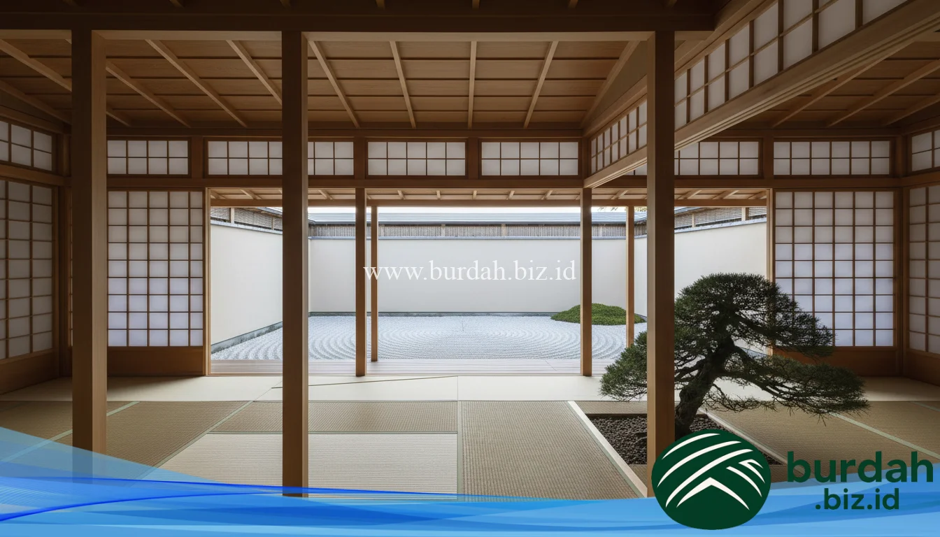
Perhaps the most powerful geometric concept of all is Ma (間). Ma is often translated as “negative space,” but that doesn’t quite capture its essence. It is not emptiness. It is the interval. The pause. It is the space between two structural posts, the silence between notes of music, the unpainted part of a scroll. In architecture, Ma is the purposeful use of open space to give meaning to the objects around it. The void defines the form. A room is not defined by its four walls, but by the volume of space those walls create. This makes the “empty” areas of a Japanese home the most active and important elements of the design. The geometry of the void is paramount.
Zen Architecture Geometry 1
Core Geometric Principles in Practice
When you start to look closely, you see these philosophies translated into a very practical geometric system. It’s a language built on a few core principles that are applied with incredible consistency and discipline. This isn’t random minimalism; it’s a highly ordered universe built from a simple set of rules.
One of the most fundamental ideas is the use of a structural grid. For centuries, Japanese construction has been based on a modular system. The traditional unit of measurement, the ken, was often standardized to the dimensions of a tatami mat. A room wasn’t just a certain number of square feet; it was a “six-mat room” or an “eight-mat room.” This created an inherent order. Everything from the spacing of columns to the height of ceilings was governed by this proportional system. The entire building becomes a rational, three-dimensional grid. This underlying order creates a subtle sense of harmony and rhythm. You feel it even if you can’t see it. It’s a quiet, reassuring logic that permeates the entire structure.
The power of the line is another crucial element. Japanese minimalist architecture is dominated by strong vertical and horizontal lines. The post-and-lintel system of construction makes this explicit. You have vertical columns and horizontal beams. There are very few arches or complex curves. This focus on the straight line does several things:
-
It creates a sense of stability and calm. The eye follows the lines easily, without distraction.
-
It frames views. A rectangular window or an open doorway becomes a carefully composed frame for the garden outside.
-
It defines space clearly. The grid of a shōji screen or the lines of a wooden floor guide your perception of the room’s proportions.
While the structure is often linear, the circle makes important appearances. The ensō, a circle hand-drawn in one or two uninhibited brushstrokes, is a sacred symbol in Zen. It represents the universe, the void, and enlightenment. In architecture, this finds expression in circular windows, known as marumado. These “moon windows” are a powerful geometric contrast to the dominant rectilinear grid of the building. They act as a focal point and often frame a very specific, curated view of a single tree, a stone lantern, or the moon itself. The geometry here is symbolic, connecting the earthly structure to the celestial and the infinite.
Zen Architecture Geometry 2
Light and Shadow: The Intangible Geometry
In the West, we often think of architectural space as being defined by solid materials. Walls, floors, roofs. But in Japanese design, the intangible elements of light and shadow are treated as primary building materials. They are deliberately sculpted using geometry. The architecture is not just a container for light; it is an instrument for modulating it.
The most famous example of this is the shōji screen. These sliding panels, made of a wooden lattice covered in translucent washi paper, are a work of genius. They are not solid walls. They are permeable membranes. The geometric grid of the wooden frame is a constant visual presence, while the paper diffuses the harsh exterior light into a soft, even, ethereal glow. The quality of light inside a room with shōji is completely different from one with glass windows. It’s gentle, calming, and eliminates harsh shadows. The screen transforms sunlight from a force into a presence.
The geometry of the roof is also critical in this manipulation of light. Traditional Japanese buildings feature deep eaves that extend far beyond the walls. This is not just for decoration. Their projection is a calculated geometric response to the environment. In the summer, when the sun is high in the sky, the eaves cast deep shadows, keeping the interior cool and protected from direct glare. In the winter, when the sun is low on the horizon, its rays can pass under the eaves, reaching deep into the house to provide light and passive warmth. This is a sophisticated form of climate control achieved through simple, elegant geometry.
Shadows, or kage, are not seen as a lack of light but are celebrated as an essential part of the composition. The famous author Jun’ichirō Tanizaki wrote a whole essay, “In Praise of Shadows,” about this very concept. The darkness in the recess of an alcove, the deep shade under the eaves—these are intentional design elements. The interplay between the bright, geometric planes of a sunlit floor and the deep, mysterious darkness of a corner creates depth, texture, and a sense of tranquility. The building’s geometry is designed to create these pockets of shadow, making the space feel more complex and inviting.
Zen Architecture Geometry 3
Integrating Nature: Shakkei and Blurred Boundaries
A core tenet of the Zen worldview is the interconnectedness of all things, especially the bond between humans and nature. Japanese architecture does not see a building as an object imposed upon the land. It sees it as a part of the land. The geometry of the structure is intentionally designed to merge with the geometry of the natural world around it. This is a deep, philosophical commitment to harmony.
The most elegant expression of this is shakkei, or “borrowed scenery.” This is the technique of incorporating the surrounding landscape into the design of a garden and, by extension, the house itself. An opening in a wall, a window, or the space between two posts is not just an aperture; it is a meticulously designed frame. This frame is geometrically positioned to capture a specific view—a distant mountain, a cluster of bamboo, or even just a uniquely shaped branch of a nearby tree. That distant mountain is now part of your garden. The tree is now part of your room. The architecture “borrows” the beauty of the natural world, making the boundary between inside and outside dissolve.
This blurring of boundaries is a recurring theme. The engawa, a veranda-like space under the deep eaves, is a perfect example. It’s neither fully inside nor fully outside. It’s a transitional zone. With the outer screens open, the living space flows seamlessly onto the engawa and then into the garden. The floor of the room and the deck of the veranda are often at the same level, removing any physical or visual barrier. This creates a feeling of immense openness and connection to the outdoors. The geometry is used to deconstruct the box, to open the home to the sights, sounds, and smells of nature. It’s a complete rejection of the idea of a house as a sealed fortress against the elements.
Zen Architecture Geometry 4
Modern Interpretations of Zen Architecture Geometry
You might think these principles are confined to traditional temples and teahouses. Not at all. The spirit of this hidden geometry is alive and well, and it forms the basis for some of the most powerful modern architecture in the world. Contemporary architects have taken these core ideas—the grid, the manipulation of light, the reverence for materials, and the connection to nature—and reinterpreted them with modern materials like concrete, steel, and glass.
No one has done this more masterfully than Tadao Ando. His work is the ultimate proof of the enduring power of Zen Architecture Geometry. Ando works almost exclusively with smooth, exposed concrete, a material that could feel cold and brutal. Yet his buildings are deeply spiritual and serene. Why? Because he is a master of pure geometry. He uses simple shapes—squares, rectangles, circles—and the most basic element of all: light. His famous Church of the Light is a simple concrete box. Its defining feature is a cruciform-shaped cut in the wall behind the altar. The cross is not an object. It is a void, an absence of material, through which pure light streams into the dark interior. It is an act of sublime geometric poetry.
Ando constantly plays with solid and void, light and shadow, and the experience of moving through a sequence of geometrically defined spaces. His buildings often feature courtyards open to the sky, forcing you to experience the rain and the wind as part of the architectural journey. He uses long, straight walls to guide the eye and create a sense of procession, and then suddenly opens up a view to a single, perfectly placed tree. It’s all the principles of Ma, shakkei, and the power of the line, just expressed in a modern vocabulary.
Other architects, like Kengo Kuma, explore these ideas through different materials. Kuma is known for his intricate use of wood, creating complex geometric lattices and screens that echo the traditional shōji but on a much larger, more structural scale. His work is a reminder that the geometry is not tied to one specific material, but is a way of thinking about space, pattern, and light that can be adapted and evolved.
Zen Architecture Geometry 5
The Human Experience of Geometric Space
So, what is the ultimate effect of all this? What does it feel like to be inside a space governed by this hidden geometry? It’s not an intellectual experience. It’s a visceral one. It’s about how the space makes you feel. The rigorous underlying order is not meant to be consciously analyzed; it’s meant to be absorbed. It works on a subconscious level to create a profound sense of calm.
The lack of clutter and ornamentation reduces mental noise. In a world of constant stimulation, a minimalist space offers a place of refuge. Your mind doesn’t have to process a thousand different objects, colors, and patterns. It is free to rest. The clean, strong lines provide a sense of stability and order, which can be incredibly grounding in a chaotic world. The careful proportions, based on human scale and modular systems, create a feeling of harmony. The space simply feels right, in a way that is hard to put into words.
This geometry also guides behavior. A long, narrow corridor encourages movement. An open, square room with a central focus invites stillness and gathering. A low window that requires you to kneel to see the garden outside encourages a posture of humility and contemplation. The architecture is not a passive backdrop; it is an active participant in your experience, gently nudging you toward a more mindful state of being.
Ultimately, the hidden geometry of Japanese minimalist architecture is a geometry of subtraction. It is about what is left out. It is about stripping away everything that is unessential to reveal a deeper truth. It is a search for purity of form and clarity of thought. The resulting spaces are not empty. They are full of light, shadow, nature, and a quiet, powerful sense of peace. They are proof that the most profound experiences often come not from what is added, but from what is taken away.